> ## Documentation Index
> Fetch the complete documentation index at: https://docs.qonto.com/llms.txt
> Use this file to discover all available pages before exploring further.
# Amount Field
An amount field is a specialized input component designed for entering monetary values. It provides automatic formatting for currency display, decimal handling, and locale-specific number formatting.
## Default Styling
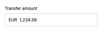
By default, the Amount Field uses Qonto's branding and includes a currency indicator (EUR by default):
 ## Customization Options
All customizable components are subject to being styled with [global CSS
properties](./global-customizations) exposed by the Qonto Embed SDK. If no
component-level style is applied by the SDK, the global styles will be used if
they are defined.
The Amount Field can be customized using the following CSS variables:
| CSS Variable | Description & Accepted Values |
| ---------------------------------------------------- | ------------------------------------------------------------------------- |
| `--qonto-embed-input-amount-gap` | Gap between label, input, and error message (e.g., `4px`, `8px`). |
| `--qonto-embed-input-amount-label-font-size` | Font size for the label (e.g., `14px`, `1em`). |
| `--qonto-embed-input-amount-label-color` | Color of the label text. |
| `--qonto-embed-input-amount-label-font-weight` | Font weight of the label (e.g., `400`, `bold`). |
| `--qonto-embed-input-amount-border` | Border style for the input (e.g., `1px solid #ccc`). |
| `--qonto-embed-input-amount-border-radius` | Border radius for the input (e.g., `4px`, `8px`). |
| `--qonto-embed-input-amount-padding` | Padding inside the input (e.g., `8px 12px`). |
| `--qonto-embed-input-amount-currency-font-size` | Font size for the currency indicator (e.g., `14px`). |
| `--qonto-embed-input-amount-currency-color` | Color of the currency indicator when input has value. |
| `--qonto-embed-input-amount-currency-font-weight` | Font weight of the currency indicator. |
| `--qonto-embed-input-amount-text-font-size` | Font size for the input text (e.g., `14px`). |
| `--qonto-embed-input-amount-text-color` | Color of the input text. |
| `--qonto-embed-input-amount-placeholder-color` | Color of the placeholder and currency when empty. |
| `--qonto-embed-input-amount-focus-border-color` | Border color when the input is focused. |
| `--qonto-embed-input-amount-focus-border-shadow` | Box shadow when the input is focused (e.g., `0 0 0 4px rgba(0,0,0,0.1)`). |
| `--qonto-embed-input-amount-disabled-background` | Background color when the input is disabled. |
| `--qonto-embed-input-amount-disabled-border-color` | Border color when the input is disabled. |
| `--qonto-embed-input-amount-disabled-text-color` | Text color when the input is disabled. |
| `--qonto-embed-input-amount-disabled-currency-color` | Currency indicator color when disabled. |
| `--qonto-embed-input-amount-error-border-color` | Border color when the input has an error. |
| `--qonto-embed-input-amount-error-message-color` | Color of error messages. |
The Amount Field automatically formats numbers based on the specified locale
and handles decimal precision. The formatting and behavior are controlled by
the component itself and cannot be customized via CSS.
### Example
This example shows a customized Amount Field:
```css theme={null}
:root {
--qonto-embed-input-amount-gap: 16px;
--qonto-embed-input-amount-label-font-size: 14px;
--qonto-embed-input-amount-label-color: #333;
--qonto-embed-input-amount-border: 5px solid #d1d5db;
--qonto-embed-input-amount-border-radius: 16px;
--qonto-embed-input-amount-padding: 12px;
--qonto-embed-input-amount-currency-color: #6b7280;
--qonto-embed-input-amount-text-color: #111827;
}
```
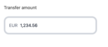
The result is an amount field with increased padding, thicker borders, rounded corners, and a custom color scheme:
## Customization Options
All customizable components are subject to being styled with [global CSS
properties](./global-customizations) exposed by the Qonto Embed SDK. If no
component-level style is applied by the SDK, the global styles will be used if
they are defined.
The Amount Field can be customized using the following CSS variables:
| CSS Variable | Description & Accepted Values |
| ---------------------------------------------------- | ------------------------------------------------------------------------- |
| `--qonto-embed-input-amount-gap` | Gap between label, input, and error message (e.g., `4px`, `8px`). |
| `--qonto-embed-input-amount-label-font-size` | Font size for the label (e.g., `14px`, `1em`). |
| `--qonto-embed-input-amount-label-color` | Color of the label text. |
| `--qonto-embed-input-amount-label-font-weight` | Font weight of the label (e.g., `400`, `bold`). |
| `--qonto-embed-input-amount-border` | Border style for the input (e.g., `1px solid #ccc`). |
| `--qonto-embed-input-amount-border-radius` | Border radius for the input (e.g., `4px`, `8px`). |
| `--qonto-embed-input-amount-padding` | Padding inside the input (e.g., `8px 12px`). |
| `--qonto-embed-input-amount-currency-font-size` | Font size for the currency indicator (e.g., `14px`). |
| `--qonto-embed-input-amount-currency-color` | Color of the currency indicator when input has value. |
| `--qonto-embed-input-amount-currency-font-weight` | Font weight of the currency indicator. |
| `--qonto-embed-input-amount-text-font-size` | Font size for the input text (e.g., `14px`). |
| `--qonto-embed-input-amount-text-color` | Color of the input text. |
| `--qonto-embed-input-amount-placeholder-color` | Color of the placeholder and currency when empty. |
| `--qonto-embed-input-amount-focus-border-color` | Border color when the input is focused. |
| `--qonto-embed-input-amount-focus-border-shadow` | Box shadow when the input is focused (e.g., `0 0 0 4px rgba(0,0,0,0.1)`). |
| `--qonto-embed-input-amount-disabled-background` | Background color when the input is disabled. |
| `--qonto-embed-input-amount-disabled-border-color` | Border color when the input is disabled. |
| `--qonto-embed-input-amount-disabled-text-color` | Text color when the input is disabled. |
| `--qonto-embed-input-amount-disabled-currency-color` | Currency indicator color when disabled. |
| `--qonto-embed-input-amount-error-border-color` | Border color when the input has an error. |
| `--qonto-embed-input-amount-error-message-color` | Color of error messages. |
The Amount Field automatically formats numbers based on the specified locale
and handles decimal precision. The formatting and behavior are controlled by
the component itself and cannot be customized via CSS.
### Example
This example shows a customized Amount Field:
```css theme={null}
:root {
--qonto-embed-input-amount-gap: 16px;
--qonto-embed-input-amount-label-font-size: 14px;
--qonto-embed-input-amount-label-color: #333;
--qonto-embed-input-amount-border: 5px solid #d1d5db;
--qonto-embed-input-amount-border-radius: 16px;
--qonto-embed-input-amount-padding: 12px;
--qonto-embed-input-amount-currency-color: #6b7280;
--qonto-embed-input-amount-text-color: #111827;
}
```
The result is an amount field with increased padding, thicker borders, rounded corners, and a custom color scheme: