> ## Documentation Index
> Fetch the complete documentation index at: https://docs.qonto.com/llms.txt
> Use this file to discover all available pages before exploring further.
# Customizing ui elements
The Qonto SDK injects UI components directly into your application for certain features like card display and transaction management. To maintain consistency with your brand, the SDK provides comprehensive customization options through CSS variables.
When no customization is applied, UI elements use Qonto's default styling and
branding.
# How It Works
The SDK uses [CSS custom properties](https://developer.mozilla.org/en-US/docs/Web/CSS/CSS_cascading_variables/Using_CSS_custom_properties) (CSS variables) for styling. Instead of passing styles as function parameters, you define CSS variables in your application's stylesheet, and the SDK automatically applies them to injected UI components.
## Implementation Steps
Add the SDK's CSS variables to your application's stylesheet with your
custom values.
Use SDK functions normally—they'll automatically apply your custom styles.
# Example: Customizing Card Display
This example demonstrates customizing the `displayCard` function to match your application's branding.
## Default Styling
The default card display uses Qonto's branding:
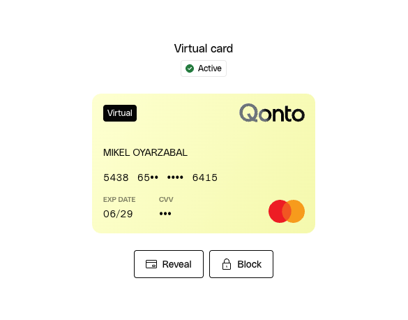 Customizable elements in this screen include:
* **Text**: Headings and body text
* **Badges**: Status indicators (e.g., "Active")
* **Buttons**: Primary and secondary button styles
## 1. Define Custom Styles
Add CSS variables to your stylesheet:
```css theme={null}
:root {
/* Primary colors */
--qonto-embed-color-primary: #7e1adb;
--qonto-embed-content-color-primary: #3c3c3c;
/* Button styles */
--qonto-embed-button-secondary-font-color: #7e1adb;
--qonto-embed-button-secondary-border: 1px solid #7e1adb;
--qonto-embed-button-border-radius: 24px;
/* Badge styles */
--qonto-embed-badge-height: 20px;
--qonto-embed-badge-background-color-neutral: #f5f2f0;
--qonto-embed-badge-background-color-success: #ebf7ea;
--qonto-embed-badge-background-color-warning: #fdf6b2;
--qonto-embed-badge-background-color-error: #fde8e8;
--qonto-embed-badge-border-radius: 16px;
}
```
You can customize additional CSS variables as needed. Refer to the [UI
Customization API
Reference](/api-reference/sdk-libraries/doc-pages/overview-customizable-components)
for a complete list.
## 2. Implement the Display Function
Now that the styles are defined, call the `displayCard` function:
```typescript theme={null}
import { cards } from '@qonto/embed-sdk/cards';
cards.displayCard({
cardSettings: { cardId: 'your-card-id' },
operationSettings: {
uiParentElementId: 'card-container',
},
});
```
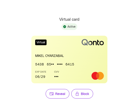
## Result
Calling the `displayCard` will cause the cards UI to be injected in the website, and this is how the customized version
will now look like this:
Customizable elements in this screen include:
* **Text**: Headings and body text
* **Badges**: Status indicators (e.g., "Active")
* **Buttons**: Primary and secondary button styles
## 1. Define Custom Styles
Add CSS variables to your stylesheet:
```css theme={null}
:root {
/* Primary colors */
--qonto-embed-color-primary: #7e1adb;
--qonto-embed-content-color-primary: #3c3c3c;
/* Button styles */
--qonto-embed-button-secondary-font-color: #7e1adb;
--qonto-embed-button-secondary-border: 1px solid #7e1adb;
--qonto-embed-button-border-radius: 24px;
/* Badge styles */
--qonto-embed-badge-height: 20px;
--qonto-embed-badge-background-color-neutral: #f5f2f0;
--qonto-embed-badge-background-color-success: #ebf7ea;
--qonto-embed-badge-background-color-warning: #fdf6b2;
--qonto-embed-badge-background-color-error: #fde8e8;
--qonto-embed-badge-border-radius: 16px;
}
```
You can customize additional CSS variables as needed. Refer to the [UI
Customization API
Reference](/api-reference/sdk-libraries/doc-pages/overview-customizable-components)
for a complete list.
## 2. Implement the Display Function
Now that the styles are defined, call the `displayCard` function:
```typescript theme={null}
import { cards } from '@qonto/embed-sdk/cards';
cards.displayCard({
cardSettings: { cardId: 'your-card-id' },
operationSettings: {
uiParentElementId: 'card-container',
},
});
```
## Result
Calling the `displayCard` will cause the cards UI to be injected in the website, and this is how the customized version
will now look like this:
 # Key Benefits
* **Brand Consistency**: Maintain your application's visual identity across all SDK components
* **Developer-Friendly**: Use familiar CSS variables instead of complex configuration objects
* **Automatic Application**: Styles apply automatically to all SDK-injected UI elements
## Learn More
Explore the complete customization capabilities in the
[UI Customization API Reference](/api-reference/sdk-libraries/doc-pages/overview-customizable-components) for all available CSS variables and components.
# Key Benefits
* **Brand Consistency**: Maintain your application's visual identity across all SDK components
* **Developer-Friendly**: Use familiar CSS variables instead of complex configuration objects
* **Automatic Application**: Styles apply automatically to all SDK-injected UI elements
## Learn More
Explore the complete customization capabilities in the
[UI Customization API Reference](/api-reference/sdk-libraries/doc-pages/overview-customizable-components) for all available CSS variables and components.