Default Styling
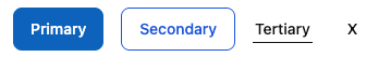
By default, buttons use Qonto’s branding and come in four variants:- Primary: The main call-to-action button with prominent styling. Features a filled background and inverted font color.
- Secondary: Alternative action button with less emphasis than primary. Features a border and transparent background.
- Tertiary: Subtle action button for less important actions. Looks like a text link with an underline.
- Ghost: Minimal styling button that appears transparent, shows a subtle background on hover.
Customization Options
All customizable components are subject to being styled with global CSS
properties exposed by the Qonto Embed SDK. If no
component-level style is applied by the SDK, the global styles will be used if
they are defined.
| CSS Variable | Description & Accepted Values |
|---|---|
--qonto-embed-button-height | Accepts any valid CSS height value (e.g., 40px, 2.5em). |
--qonto-embed-button-font-size | Accepts any valid font size value (e.g., 14px, 1em). |
--qonto-embed-button-font-weight | Accepts any valid font weight (e.g., 400, bold). |
--qonto-embed-button-primary-font-color | Accepts any valid color value for primary button text (e.g., #fff, rgb(255,255,255)). |
--qonto-embed-button-primary-background-color | Accepts any valid background color for primary buttons. |
--qonto-embed-button-primary-background-color-hover | Accepts any valid background color for primary buttons on hover. |
--qonto-embed-button-primary-border | Accepts any valid CSS border value for primary buttons (e.g., 1px solid #ccc). |
--qonto-embed-button-secondary-font-color | Accepts any valid color value for secondary button text. |
--qonto-embed-button-secondary-background-color | Accepts any valid background color for secondary buttons. |
--qonto-embed-button-secondary-background-color-hover | Accepts any valid background color for secondary buttons on hover. |
--qonto-embed-button-secondary-border | Accepts any valid CSS border value for secondary buttons. |
--qonto-embed-button-border-radius | Accepts any valid border-radius value (e.g., 4px, 8px). |
--qonto-embed-button-ghost-font-color | Accepts any valid color value for ghost button text. |
--qonto-embed-button-ghost-background-color | Accepts any valid background color for ghost buttons. |
Some aspects of the button can’t be completely customized. For example,
despite it is possible to define the background color of the buttons, the
opacity on hover is controlled by the SDK.
Example
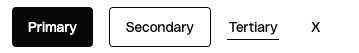
This example shows customized buttons that depart from the default Qonto styling: