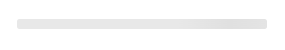
Default Styling
By default, the Skeleton Loader uses Qonto’s branding: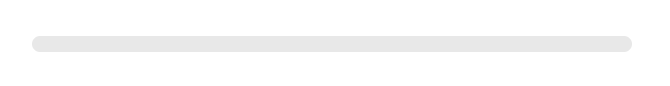
Customization Options
The Skeleton Loader can be customized using the following CSS variables:| CSS Variable | Description & Accepted Values |
|---|---|
--qonto-embed-skeleton-border-radius | Accepts any valid border-radius value (e.g., 4px, 50%, 8px). Controls the border radius of the skeleton line. |
There are some aspects of the loader skeleton that can’t be customized. For
example, it uses a shimmer animation and shows a neutral color (grayscale)
that are designed to work well in most of the scenarios.
Example
This example shows a customized Skeleton Loader with different border radius: