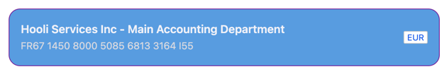
Default Styling
By default, the Beneficiary Card uses Qonto’s branding with a clean card layout: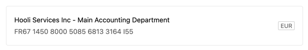
Customization Options
All customizable components are subject to being styled with global CSS
properties exposed by the Qonto Embed SDK. If no
component-level style is applied by the SDK, the global styles will be used if
they are defined.
| CSS Variable | Description & Accepted Values |
|---|---|
--qonto-embed-beneficiary-card-background-color | Background color of the card (e.g., #ffffff, #f5f5f5). |
--qonto-embed-beneficiary-card-background-color-hover | Background color when hovering over the card. |
--qonto-embed-beneficiary-card-border-color | Border color of the card (e.g., 1px solid #e8e8e8). |
--qonto-embed-beneficiary-card-border-color-hover | Border color when hovering over the card. |
--qonto-embed-beneficiary-card-border-radius | Border radius of the card (e.g., 4px, 8px). |
--qonto-embed-beneficiary-card-name-font-size | Font size for the beneficiary name (e.g., 14px, 1em). |
--qonto-embed-beneficiary-card-name-font-weight | Font weight for the beneficiary name (e.g., 400, bold). |
--qonto-embed-beneficiary-card-name-color | Color of the beneficiary name text. |
--qonto-embed-beneficiary-card-iban-font-size | Font size for the IBAN (e.g., 14px). |
--qonto-embed-beneficiary-card-iban-font-weight | Font weight for the IBAN (e.g., 400). |
--qonto-embed-beneficiary-card-iban-color | Color of the IBAN text. |
--qonto-embed-beneficiary-card-currency-font-size | Font size for the currency badge (e.g., 12px). |
--qonto-embed-beneficiary-card-currency-font-weight | Font weight for the currency badge. |
--qonto-embed-beneficiary-card-currency-color | Color of the currency badge text. |
The Beneficiary Card automatically formats IBANs with proper spacing. The IBAN
formatting logic is handled by the component and cannot be customized via CSS.
The card also supports an optional footer slot for additional content, which
will be styled with the same variables listed above.
Example
This example shows a customized Beneficiary Card: