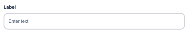
Default Styling
By default, the Text Field uses Qonto’s branding:
Customization Options
All customizable components are subject to being styled with global CSS
properties exposed by the Qonto Embed SDK. If no
component-level style is applied by the SDK, the global styles will be used if
they are defined.
| CSS Variable | Description & Accepted Values |
|---|---|
--qonto-embed-input-text-gap | Gap between label, input, and error message (e.g., 4px, 8px). |
--qonto-embed-input-text-label-font-size | Font size for the label (e.g., 14px, 1em). |
--qonto-embed-input-text-label-color | Color of the label text. |
--qonto-embed-input-text-label-font-weight | Font weight of the label (e.g., 400, bold). |
--qonto-embed-input-text-text-font-size | Font size for the input text (e.g., 14px). |
--qonto-embed-input-text-text-color | Color of the input text. |
--qonto-embed-input-text-background | Background color of the input. |
--qonto-embed-input-text-border | Border style for the input (e.g., 1px solid #ccc). |
--qonto-embed-input-text-border-radius | Border radius for the input (e.g., 4px, 8px). |
--qonto-embed-input-text-padding | Padding inside the input (e.g., 7px 11px). |
--qonto-embed-input-text-placeholder-color | Color of the placeholder text. |
--qonto-embed-input-text-focus-border-color | Border color when the input is focused. |
--qonto-embed-input-text-focus-border-shadow | Box shadow when the input is focused (e.g., 0 0 0 4px rgba(0,0,0,0.1)). |
--qonto-embed-input-text-disabled-background | Background color when the input is disabled. |
--qonto-embed-input-text-disabled-border-color | Border color when the input is disabled. |
--qonto-embed-input-text-disabled-text-color | Text color when the input is disabled. |
--qonto-embed-input-text-error-border-color | Border color when the input has an error. |
--qonto-embed-input-text-error-message-font-size | Font size for error messages (e.g., 12px). |
--qonto-embed-input-text-error-message-color | Color of error messages. |
Example
This example shows a customized Text Field: