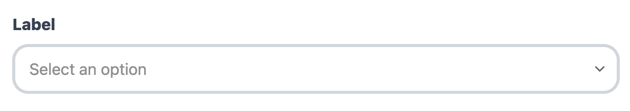
Default Styling
By default, the Select Field uses Qonto’s branding: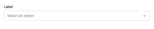
Customization Options
All customizable components are subject to being styled with global CSS
properties exposed by the Qonto Embed SDK. If no
component-level style is applied by the SDK, the global styles will be used if
they are defined.
| CSS Variable | Description & Accepted Values |
|---|---|
--qonto-embed-input-select-gap | Gap between label, input, and error message (e.g., 4px, 8px). |
--qonto-embed-input-select-label-font-size | Font size for the label (e.g., 14px, 1em). |
--qonto-embed-input-select-label-color | Color of the label text. |
--qonto-embed-input-select-label-font-weight | Font weight of the label (e.g., 400, bold). |
--qonto-embed-input-select-text-font-size | Font size for the selected text (e.g., 14px). |
--qonto-embed-input-select-text-color | Color of the selected text. |
--qonto-embed-input-select-background | Background color of the select trigger. |
--qonto-embed-input-select-border | Border style for the select (e.g., 1px solid #ccc). |
--qonto-embed-input-select-border-radius | Border radius for the select (e.g., 4px, 8px). |
--qonto-embed-input-select-padding | Padding inside the select (e.g., 7px 36px 7px 12px). |
--qonto-embed-input-select-placeholder-color | Color of the placeholder text. |
--qonto-embed-input-select-hover-background | Background color when hovering over the select. |
--qonto-embed-input-select-focus-border-color | Border color when the select is focused. |
--qonto-embed-input-select-focus-background | Background color when the select is focused. |
--qonto-embed-input-select-focus-border-shadow | Box shadow when the select is focused (e.g., 0 0 0 4px rgba(0,0,0,0.1)). |
--qonto-embed-input-select-active-border-color | Border color when the dropdown is open. |
--qonto-embed-input-select-disabled-background | Background color when the select is disabled. |
--qonto-embed-input-select-disabled-border-color | Border color when the select is disabled. |
--qonto-embed-input-select-disabled-text-color | Text color when the select is disabled. |
--qonto-embed-input-select-disabled-icon-color | Icon color when the select is disabled. |
--qonto-embed-input-select-readonly-background | Background color when the select is read-only. |
--qonto-embed-input-select-error-border-color | Border color when the select has an error. |
--qonto-embed-input-select-error-message-font-size | Font size for error messages (e.g., 12px). |
--qonto-embed-input-select-error-message-color | Color of error messages. |
--qonto-embed-input-select-icon-color | Color of the dropdown icon. |
--qonto-embed-input-select-dropdown-background | Background color of the dropdown menu. |
--qonto-embed-input-select-dropdown-border | Border style for the dropdown menu (e.g., 1px solid #ccc). |
--qonto-embed-input-select-dropdown-border-radius | Border radius for the dropdown menu (e.g., 4px). |
--qonto-embed-input-select-dropdown-shadow | Box shadow for the dropdown menu (e.g., 0 4px 8px rgba(0, 0, 0, 0.1)). |
--qonto-embed-input-select-dropdown-max-height | Maximum height for the dropdown menu (e.g., 250px). |
--qonto-embed-input-select-option-padding | Padding for each option in the dropdown (e.g., 8px 12px). |
--qonto-embed-input-select-option-font-size | Font size for options (e.g., 14px). |
--qonto-embed-input-select-option-line-height | Line height for options. |
--qonto-embed-input-select-option-color | Color of option text. |
--qonto-embed-input-select-option-hover-background | Background color when hovering over an option. |
--qonto-embed-input-select-option-selected-background | Background color for the selected option. |
--qonto-embed-input-select-option-selected-color | Text color for the selected option. |
--qonto-embed-input-select-option-selected-font-weight | Font weight for the selected option. |
The Select Field supports full keyboard navigation (Arrow keys, Enter, Escape,
Home, End) and is fully accessible with proper ARIA attributes. These
behaviors are built into the component and cannot be customized via CSS.
Example
This example shows a customized Select Field: