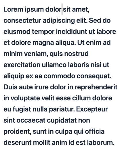
Default Styling
By default, the Text Body component uses Qonto’s branding with standard body text styling: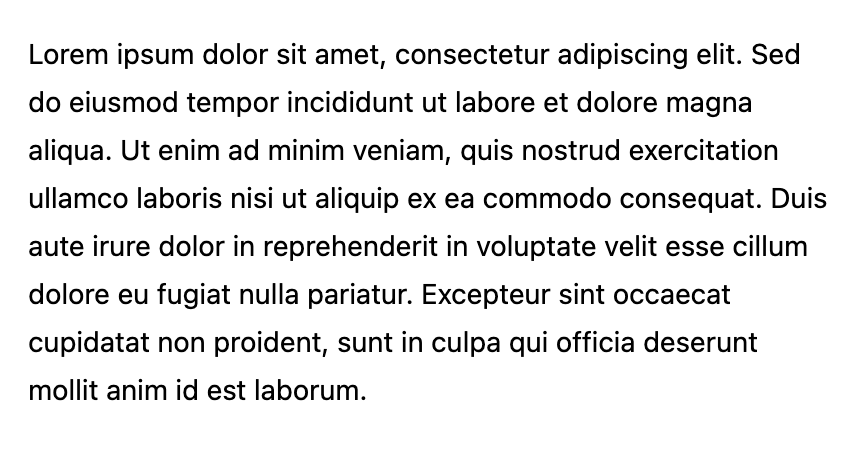
Customization Options
All customizable components are subject to being styled with global CSS
properties exposed by the Qonto Embed SDK. If no
component-level style is applied by the SDK, the global styles will be used if
they are defined.
| CSS Variable | Description & Accepted Values |
|---|---|
--qonto-embed-content-font-size | Font size for body text (e.g., 14px, 16px, 1rem). |
--qonto-embed-content-font-weight | Font weight for body text (e.g., 400, 500, bold). |
--qonto-embed-content-line-height | Line height for body text (e.g., 24px, 1.5, 1.6). |
--qonto-embed-content-color-primary | Color of the body text (e.g., #000, #333, rgb(0,0,0)). |
The Text Body component automatically wraps content in a paragraph tag and
removes default margins. It’s designed to work seamlessly with slotted
content, making it easy to integrate into your application’s content
structure.
Example
This example shows customized Text Body styling: