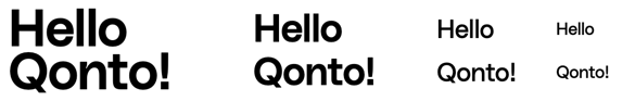
Default Styling
By default, text elements use Qonto’s typography system with four heading levels:- Heading 1: The largest heading for main titles and primary sections
- Heading 2: Secondary headings for major subsections
- Heading 3: Tertiary headings for smaller sections
- Heading 4: The smallest heading level for minor subsections

Customization Options
All customizable components are subject to being styled with global CSS
properties exposed by the Qonto Embed SDK. If no
component-level style is applied by the SDK, the global styles will be used if
they are defined.
| CSS Variable | Description & Accepted Values |
|---|---|
--qonto-embed-heading-line-height | Accepts any valid CSS line-height value (e.g., 40px, 1.5). |
--qonto-embed-heading-font-size-1 | Accepts any valid font size for heading level 1 (e.g., 32px, 2em). |
--qonto-embed-heading-font-size-2 | Accepts any valid font size for heading level 2 (e.g., 24px, 1.5em). |
--qonto-embed-heading-font-size-3 | Accepts any valid font size for heading level 3 (e.g., 20px, 1.25em). |
--qonto-embed-heading-font-size-4 | Accepts any valid font size for heading level 4 (e.g., 16px, 1em). |
--qonto-embed-heading-font-weight-1 | Accepts any valid font weight for heading level 1 (e.g., 600, bold). |
--qonto-embed-heading-font-weight-2 | Accepts any valid font weight for heading level 2 (e.g., 600, bold). |
--qonto-embed-heading-font-weight-3 | Accepts any valid font weight for heading level 3 (e.g., 400, normal). |
--qonto-embed-heading-font-weight-4 | Accepts any valid font weight for heading level 4 (e.g., 400, normal). |
Some aspects of text elements cannot be customized at component level, such as
text color.
Example
This example shows customized text elements that depart from the default Qonto styling: