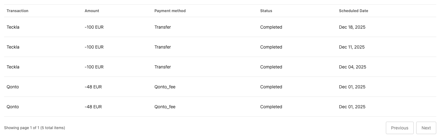
transactionList UI Element presents a table interface that displays a paginated list of
transactions. This UI element automatically fetches transaction data and renders it in a
well-organized table format with support for status indicators and pagination controls.
How it works
The transaction list is rendered by calling thecreateUIElement function with the appropriate
settings:
Emitted events
The transaction list UI Element emits the following events when users interact with it.Transaction selected
Each row in the transactions table rendered by the UI element represents a single transaction. If users click on any of them, the UI Element will emit atransaction-selected event. You can set up a listener for the event by passing a function as
the uiElementSettings.uiElementEventListener parameter when calling createUIElement.
Customizable components
The transaction list UI element is composed of the following customizable components. You can customize their appearance to match your branding:- Button - Used for pagination controls (Previous/Next buttons underneath the table) to navigate through the transaction list pages. The buttons are rendered with the secondary variant.
- Skeleton Loader - Used to display loading placeholders while transactions are being fetched from the API. Each table cell will display the skeleton loader while loading.
- Table - Used to display the transactions in a structured, scrollable, and paginated grid.