sepa-transfer-creation UI Element presents a multistep flow to help users create SEPA transfers. It will include
Verification of Payee (VOP) checks, validation of the transfer details and Strong Customer Authentication support in
those cases in which it is needed.
When initialized, the element takes the user to a step by step flow which contains the following screens:
Transfer details
While the VOP check is performed for the selected beneficiary, the screen
shows the form where users can enter the transfer details (amount, source
account, reference). 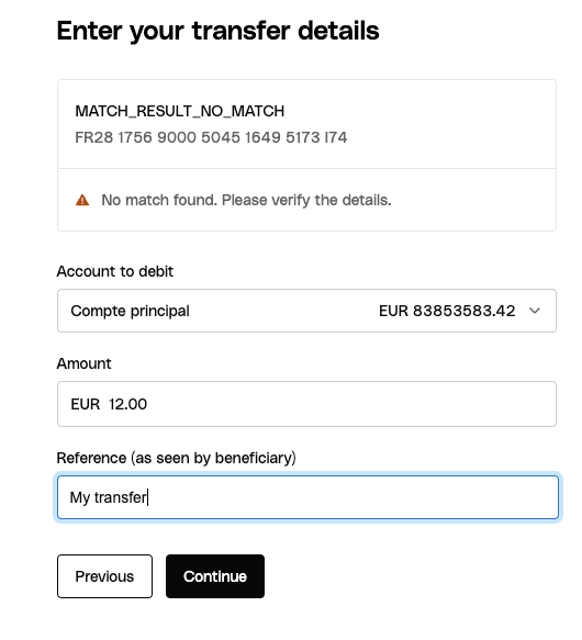
Transfer summary
A screen where the details entered in previous steps are displayed before
confirming the operation. 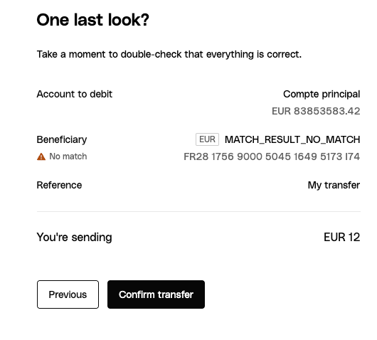
SCA authentication
If the transfer beneficiary is not trusted, an SCA authentication is
required. This step is shown as a modal on top of the transfer summary step.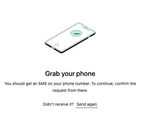
How it works
The SEPA transfer creation is rendered by calling thecreateUIElement function with the appropriate
settings:
Emitted events
The SEPA transfer creation UI Element emits the following events when users interact with it.SEPA Transfer Created
This event is emitted as soon as the transfer is successfully created. This will happen when the users land in the success step of the flow. It is useful in case you want to track the result or in case you want to automatically close the UI Element without waiting for user interaction. You can set up a listener for the event by passing a function as theuiElementSettings.uiElementEventListener parameter when calling createUIElement:
SEPA Transfer Creation Flow Completed
This event is emitted when the user clicks in the call to action that ends the process either in the success or error screens. It is a good event to listen for to return users to an initial page, or to a details page of the newly created transfer. You can set up a listener for the event by passing a function as theuiElementSettings.uiElementEventListener
parameter when calling createUIElement:
Customizable components
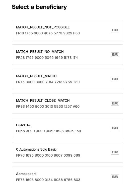
The SEPA transfer creation UI element is composed of several customizable components, spread across the different steps it can land into. You can customize their appearance to match your branding:Beneficiaries selection step
- Beneficiary Card - Used to display each beneficiary option in the list of available beneficiaries. Each card displays the beneficiary name and IBAN.
- Skeleton Loader - Used to display loading placeholders while beneficiaries are being fetched from the API. Each card will display the skeleton loader while loading.
- Heading Text - Used for the main title of the step, prompting users to select a beneficiary.
Transfer details step
- Beneficiary Card - Used to display the selected beneficiary along with the VOP check result.
- Skeleton Loader - Used to display loading placeholders while the VOP for the beneficiary is in progress.
- Heading Text - Used for the main title of the step, prompting users to enter the transfer details.
- Button - Used for navigation to previous and next steps. The previous step button shows in a secondary variant, while the next step button shows in a primary variant.
- Select Field - Used for selecting the source bank account for the transfer. Each option in this select field displays the account name as body text and the balance as secondary text.
- Amount Field - Used for entering the transfer amount.
- Text Field - Used for entering the transfer reference.
Transfer summary step
- Heading Text - Used for the main title of the step, prompting users to review the transfer details.
- Body Text - Used for displaying additional information about the transfer summary.
- Button - Used for navigation to previous and next steps. The previous step shows in a secondary variant, while the next step shows in a primary variant.
SCA step
- Heading Text - Used for the title of the SCA modal.
- Body Text - Used for displaying additional information about what the user needs to do in order to authenticate the transfer creation operation.
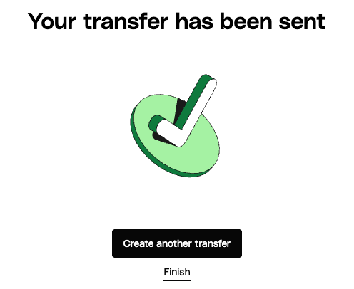
Success and error steps
- Heading Text - Used for the title of page.
- Button - Used by the user to signal the end of the flow, either with a successful creation or an error.